Almost everything archaeology wants to say is a statement about change. A site is occupied, abandoned, reoccupied. A tool form shifts over ten thousand years. A vessel breaks, and centuries later someone puts it back together. A skull gets rounder, a brow ridge recedes.
And almost none of that is directly photographable. The camera records a moment; the argument is about a sequence. So archaeologists have spent two centuries inventing ways to draw time — section drawings, typological series, phase plans, reconstruction sequences — and every one of them is a workaround for the same problem: the thing you are describing is not in front of you all at once.
What has changed recently is not the problem. It is the cost of producing the picture. Four kinds of visual argument, and what it now takes to make each one.
Change stacked vertically: the section drawing
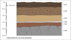
A section drawing turns time into space: cut a vertical face through a deposit and the sequence you are arguing for is stacked in front of you, undisturbed deposits running oldest at the bottom. That last qualifier is the whole discipline in one clause — the law of superposition holds only where nothing has cut, slumped or been dug back into.
__________________________
__________________________
Which is why the drawing carries context numbers, a scale bar, a levelled datum, and a note of which way the face is looking — the elements a reader needs to check the claim. (A north arrow belongs on a plan, not on a section; what a section needs is its orientation stated.) The relational logic behind it — which context cuts which, what must be earlier than what — is usually recorded separately as a Harris matrix, and the drawing is where that logic becomes legible to someone who was not standing in the trench.
The bottleneck has always been production. A publishable section drawing traditionally means inking by hand or rebuilding the whole thing in vector software, and then redoing it when a reviewer disputes a context boundary. This is the part that has genuinely changed: a scientific figure generator will take a written description of a sequence — six deposits, an ash lens between two of them, a compacted floor above bedrock — and return a labelled draft in the conventional flat style for you to correct.
One rule has to travel with that convenience, and it belongs here rather than three sections further down. The sequence is the excavator’s judgement; the tool only sets it in type. A generated section is a drafting shortcut, never a source of stratigraphic interpretation, and the figure caption should say how the drawing was produced.
Change laid out sideways: the comparative series
A comparative series lays specimens in a row so the eye can read directional change across them — the typological sequence, the cranial series, the projectile point chronology. It makes an argument no single specimen can: that the differences run one way rather than scattering.
__________________________
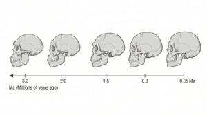 __________________________
It also carries a risk every first-year student is warned about — a tidy row implies a tidy lineage, and evolution rarely obliges. The figure above illustrates the trap as much as the technique: the specimens sit at roughly even intervals, while the dates underneath them are not evenly spaced at all. The honest version stretches the spacing to match the dates and marks plainly where the gaps in the record are.
Between two known states: the interpolation problem
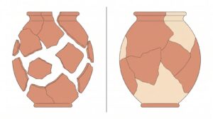
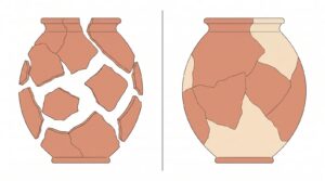
Interpolation is the case where you hold two states of the same object and nothing in between. The vessel as excavated and the vessel reconstructed; the wall standing and collapsed; two points in a sequence with no surviving intermediate.
__________________________
__________________________
Static before-and-after pairs, like the one above, are the standard treatment — and they work, but they leave the transformation itself to the reader’s imagination. Video models that take a start and end frame fill exactly that gap: you supply both states as images and the model generates the transition between them, rather than inventing an ending of its own. For a museum label or a lecture, watching sherds close into a pot does something a side-by-side pair does not.
It also needs a hard rule attached, and this is not a small point. The frames you supply are evidence; everything between them is illustration. The model is interpolating a plausible path, not recovering a real one. That is acceptable — even useful — for public engagement, and it is not acceptable where a reader might take the intermediate states as findings. Label it as a reconstruction, the same way a reconstruction drawing has always been labelled.
Putting a person inside the site
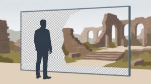
Compositing a presenter over site imagery is an explanation problem, not an evidence problem — which is precisely why it has a different set of rules. The interpretive video, the museum screen, the teaching clip where someone talks you through a plan.
________________________
________________________
The technical requirement is unglamorous but real: you need the presenter separated from whatever wall they were filmed against, so they can be composited over the site plan, the reconstruction, or the excavation photograph. Tools that remove video background do this without a green screen, and the export format matters more than most people expect — for anything that will play on a web page the file has to carry a genuine alpha channel, which in practice means WebM rather than MP4. Export it wrong and the presenter arrives with a black rectangle around them.
Four problems, four formats
| What you are showing | Form | Output | Where it goes |
|---|---|---|---|
| A sequence of deposits | Section drawing | Labelled vector or raster figure | Site report, journal article |
| Directional change across specimens | Comparative series | Single figure, specimens to scale | Journal article, textbook |
| A transformation between two known states | Before/after pair, or generated transition | Static pair, or short clip | Museum label, lecture, outreach |
| A person explaining a site | Cut-out presenter over site imagery | Transparent-background video | Museum screen, teaching, web |
The pattern across the table is that the first two are arguments and the last two are explanations. Confusing the two is where visual archaeology goes wrong — a generated transition dropped into a site report is a category error, however good it looks.
Where all of this stops
None of these tools decide anything. A section drawing does not establish a sequence; the excavator does, and the drawing communicates it. A generated transition does not reconstruct a process; it renders an assumption someone already made. The risk with cheaper figures is not that they are bad — it is that they are easy, and easy pictures get made before the argument behind them is settled.
The old constraint had one accidental virtue: spending a day on a drawing forced you to decide what you actually believed before you drew it. That discipline now has to be deliberate. Decide the sequence, then draw it. Label reconstruction as reconstruction. And when a reviewer disputes a context boundary, be glad the correction is cheap — because now there is no excuse for leaving it wrong.
___________________________
POPULAR ARCHAEOLOGY ON INSTAGRAM

___________________________